A couple months ago my husband and I got the brilliant idea (mainly me) of giving our ten yr old son our master bedroom. I know, I know crazy! Anyway, that sent the decorating motors into overdrive. He loves many things that most 10 yr old boy's do, video games, Pokemon, and Star Wars. The issue is at ten you don't really want to tie into a theme because by 13 your doing it all over again.
So what to do....with a tight budget. Shop the house of course and a few dollars at Walmart. First thing I choose is always the paint color. I know, from a decorating stand point that is suppose to be the last thing you pick. I however never follow directions and having a paint color always inspires me in a direction. The only issue with that is picking a paint color is always the toughest part of the room for me. I can spend weeks picking paint swatches and searching the Internet for others room color inspirations. Well I finally found a paint...or at least I thought I did. I figured I couldn't go wrong with apple green in a boy's room.
After all my son loves green and he did love this green. Doesn't everyone love a green that you have to where sun glasses for so it doesn't burn your eyes from shock. I tried to live with it, it was new and something that I wasn't use to. Well that lasted till the next day. Then I thought I would try a blue I used in my Laundry room. It was the perfect shade of blue, not to baby blue and not to beachy. I would call it a lofty blue, current, and boy like.
Next I was on the search for bedding. I still wanted that bright apple green and found the perfect quilt at home goods for about 20.00. I had brown pillow shams and added a couple standard bright green pillow shams from Walmart. I turned his bed sideways for a daybed style look.
With the drawers facing forward, he has access to his toy's.
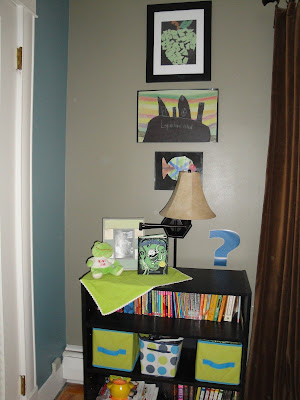
For his wall's I found the perfect solution, why not feature his own artwork. So bright and colorful, love the punch it adds. Now every time I am in his room I smile when I see them. They were all from Kindergarten till now. The best part was they were free.. the frames were from Walmart and only like 4.00each.
I wanted to include a desk for him in his room but it was not in the budget.
So shop the house, didn't have to go far it was already in the room. The old crappy six drawer dresser (I bought about 20 yrs ago) with the ugly gold knobs and fake wood laminate. My husband and son went to work. First then removed all the drawers, then hammered out all the supports and sawed off the bottom front moldings then sanded it (they love demo). Next I took over, first I primed and then put on about 4 coats of black chalkboard paint. It's not perfect but not bad for something that was getting ready for a swift kick to the curb.
Next, where to put all those books... I bought two basic black bookshelves from Walmart for about 15.00 each. They were the perfect contrast color to the blue walls and also serve as side table to balance the room visually. The cute little baskets on the shelves came from the dollar store they were suggested from my friend
Tami
Tami
Paint on back wall is Smokey Slate~ Olympic (Lowes)
Other wall art I added were black coat hangers from Lowes (2.95per) and the 123 were the stickers you put on your mailbox (be warned they will peel paint).
I also added some tin numbers I had in another room (from Label Shopper) and some peel and stick letters from Walmart clearance section (they don't peel paint). I laughed because my son said they were swearing! LOL ooops.
The swear word...
The big clock was my splurge from Walmart but worth it. The other half of the room is still a work in progress.
If you have any questions feel free to leave a comment I will try and answer :)
Click on the photo's for a larger view:)





















It all looks great! Love the swear word (perfect for a 10 year old!) The artwork really works well too. VERY CUTE, LOGOPOGO!
ReplyDeleteAlso, thanks for the shout-out!
LOL, I know it's probably painful to read but thanks for being nice. Maybe my two followers will come see yours. LOL
ReplyDeleteI am now a follower on yours. Slowly figuring it out:)
Didn't realize I was swearing till Logan told me...duh!
Is the wall with the bed the smoky slate paint color??
ReplyDeleteTo attract more clients and increment your odds of procuring new business adventures, your logo ought to be fit for making a decent picture and a confiding in notoriety.logo design service
ReplyDelete